


Real life action for boys: a Royal Signal Corps rider bursts through the cover amidst a ring of fire. We’ve covered them before in this blog but I love the period appearance of this magazine. It was the end of old money 1s6d is the new 7 1/2pence.

Real life action for boys: a Royal Signal Corps rider bursts through the cover amidst a ring of fire. We’ve covered them before in this blog but I love the period appearance of this magazine. It was the end of old money 1s6d is the new 7 1/2pence.
Earlier this week I managed to watch the new Dredd movie outing: this one with the appropriately stoney faced Karl Urban (Eomer of LotR) as the man with the badge. It was a grim, ultraviolent tale of a dystopian future Mega City with a population on the edge. They kept the story tight to limit the characters background explanations; concentrating the story on a City-Block drug bust. There was some good Lawmaster riding action on the streets too: his single sided swingarm ride could chase down the worst of ’em. One aspect of the film was the use of Carlos Ezquerra’s original vision of JD, a lean, mean lawman who isn’t to be messed with. No eagle shoulder patch, but that seemed kinda superfluous anyway. Cassie Anderson as a rookie on her street assessment added good depth; especially with her psychic abilities.
Great Stuff!


I had change from my ten pence for a black-jack, a kola-cube and a sherbet filled flying saucer. But I got the latest edition of Action! This week’s edition included a story based on a UK where adults have all been wiped out leaving everyone under the age of 18 in charge of their destinies. Lord of the Flies meets Grange Hill (the early years). There was a lot of yob culture represented in the anarchy.

So the motorcycle was used as gang ‘steeds’, the hog riders running over the opposing groups, ransacking territory, cracking skulls, quite literally. The newspapers, Esther Rantzen and other wardens of cotton wool had a field day!

How did they get away with this? Boys aged between 8 and 15 were craving this each week! And it’s not putting a good face to bikers either.

Petrol bombs, and other terrorist methods were illustrated each week. This story was the nail in the coffin for Action; they’d stepped over the line – reflecting a world out of control; inner city schools were scary enough, but without authority to contain, the result was carnage.

Great illustration by Mike White of what looks like a Triumph in darkened silhouette as the rider is run-down by a transit van. Obviously kids: don’t try this at home!
Before 2000AD, the sci-fi comic which has starred the iconic Judge Dredd since 1977, there was a short lived publication called Action. It was written for the male UK youth of the day; pre-punk, mid-Labour meltdown, post 60’s pop. An aggressive line up of killer sharks, football hooligans, anarchy on the streets; it only lasted 36 editions before it was shut down for its ultra-violent content. It mimicked what movies of the day portrayed: Jaws, Rollerball, Dirty Harry to name a few. It did however cut the teeth of writers and illustrators who went on to great effect in 2000AD: sub-editor Steve MacManus (who became Tharg the Mighty during that titles ‘golden era’ in the eighties), writers John Wagner and Pat Mills, and the fantastic penmanship of the likes of Carlos Ezquerra (who devised the appearance of Joe Dredd) and Dave Gibbons (the artist for Alan Moore’s Watchmen).
Digging through the numerous stories motorcycles take a leading role in the action: one classic story is Death Game 1999. A futuristic ice-hockey/pinball mix played with motorcycle riding convicts. The body count was the spectators interest, not the score. One final episode covered blatant violent artwork with a large BA-ROOM. (what makes a sound “ba-room?”). Cinders, tire studs and speed: that’s Action. Massimo Belardinelli’s artwork is too sublime to censor with letter-noise.
 This was an obvious precursor to Harlem Heroes and it’s spinoff Inferno; itself heading down the violence-game route a few years later. I’ve covered these here.

More tomorrow! Only 7p at your newsagent!
Poster art and printmaking are in a strong resurgence right now, harking back to the heyday of poster graphics in the early Twentieth Century. Here a clean print of an orange and white stripe dress’d gal atop a sweet sky blue Twentyone ‘bathtub’. The paper colour becomes the skin, all else is tinted for detail and depth. The artist is Chris Thornley. A graphic artist who also goes by the name Raid71. This is one from his series ‘Angels from Hell’. The couple on a Bonnie is a cracker too! Great Stuff!

Engineering Balance: a simple composition of engine, tank, exhaust & carb. This is the original appearance of the early 70’s Bonnie. Mustard yellow is a particular taste but good for its era.

Go Triumph! go!
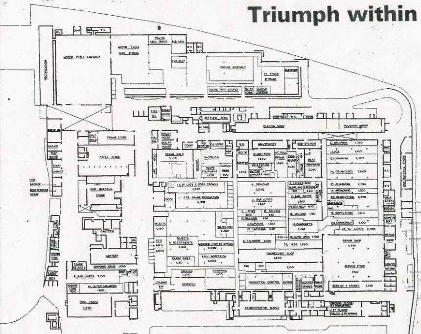
As long as I can remember I’ve always had a fascination with maps and plans. Understanding the ‘lay of the land’ so to speak. A map tells you not only where you are but also what is around you. An Interweb search has recovered this factory plan of Triumph Meriden. In it you can see a fabrication and assembly process from raw materials, through machining, enameling, through to assembly and on to testing and despatch. The repair shop is also there; so aftercare is within the factory. You can easily stroll the hallways smelling the oily swarf emu bating from the machine shops, fresh rubber tiles being mounted to finely tuned wheels and the first grunts of the bikes as they receive their life giving kicks by the testers.
“The miracle, or the power, that elevates the few is to be found in their industry, application, and perseverance under the prompting of a brave, determined spirit.”
Mark Twain 1835-1910
How else would Santy get about his stables than on a red Triumph Bonneville?
MERRY CHRISTMAS!

Line, colour and shape: put ’em together just-so and visions appear. Here’s the classic lines of a ’68 Bonnie, considered by many to be the best of ’em!

This online CAD drawing was downloaded then rendered in Photoshop.
I downloaded a wee app for the phone that allows finger scribbling. So I had a go with a Triumph digit-painting. The screen is small and a stylus would add accuracy; but it’s a handy dandy little notepad tool. Fun!

Patterns in the Machine: tire treads can be defined as an endless repetitive pattern. And when broken down is three different ‘blocks’ which with a simple overlapping intersection repeat creates the knobby grip on the rougher pavement. It’s the rubber itself that provides much of the friction for go and stop.

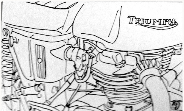
Another penned line drawing of the bike. A little more engine detail framed by the tank, seat and exhaust headers.
10 minutes scribble…
A quick doodle of the old Moto as she sits waiting for a quick tickle of the carbs and kick into life…
… I may do a short series of sketches as a study of the shapes, form and component of this bike.

Netherlandgraffiti: a Moto themed tag on the side of a box van in one of the street markets of Amsterdam. I can’t fully read the artists tag but it looks like ¡DiCe!

Knowledge is Power! When embarking on the restoration odyssey gleaning as much information as possible about your particular moto is one of the most pleasurable. Well before bloodied knuckles, cursing screams and emptying coffers turn ‘The Project’ into a seemingly unendurable rout, amassing the history, details, period test articles, manuals is a great way to start learning about your machine.
Advertising is a good start: how did the team in the boardroom want to sell the ‘bikes? Fun, functionality? Or just those sleek, sweet lines of a steed of speed?

Remember this was modern design of it’s day! Features that put it above and beyond of the competition (bar a Vincent Black Lightning of course…). Love those illustrations, which were for the most part direct traced renderings of photographs.

“And Lo, it came to pass…”
Better get yerself a decent shelf-full of manuals which illustrate in line and photo how to both dismantle the machine and then put ‘er back together without leaving so much as a nut or bolt out. The Haynes book is legend as a well organised tome which presents a blow-by-blow account of the major sections of a motorcycle: engine, gearbox, chassis, suspension, wheels, and electrics.

A ‘Bible’ it seems, but more of a concise survey of the model; well worth a peruse to understand a bikes development. When did the rigid frame give up for a swing arm? What years have the smart nacelle headlight shroud? What colour was applied in what year?

Of course noting is a substitute for an Owners Instruction Manual, Workshop Manual and Replacement Parts Book. These are essential for the devoted restoree… … we hope you haven’t given up yet! Has the parts been delegated to a corner of the garage yet? Don’t lose heart, the fun hasn’t even started yet!

One of the most important things you DO need at this point in the game is an inspiration, a vision of your goal. Good photos of your model abound on the ‘Web for this. But one better thing would be to look at a bike ‘in the flesh’; look it over, take your own photos; if you could even ride it (if the devoted owner lets you) that’ll give you a faster pulse and the energy to forge ahead…

