Branding is a name, branding is identity, branding is recognition. In the motorcycle world none more so than Triumph. With over a century of visibility the marques logo has developed and adapted with its place through history to create a timeless brand.
The latest logo was developed by the ad agency Wolff Olins.
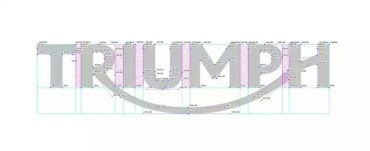
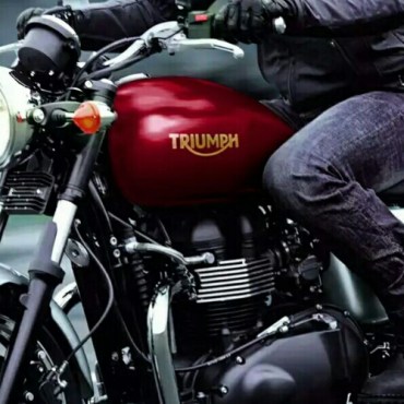
It has evened out lettering, equal height and rounded off serif to create a hint of slope and movement. Looks good on the tank…
For the nerdy graphic designers…
Here’s the technical font structure and letter space kerning. More to it than meets the eye for sure.


