July 31, 2014

TinTin takes to the highways of The West in this conceptual idea of an adventure for our young intrepid hero. Like some gallic Wyatt and his knight-companion Billy ‘Haddock’. Snowy is erstwhile George Hanson and no doubt the Thompson Twins represent a bifurcate counterculture; split between the sixties laissez-faire and the serious seventies just around the corner.
Posted in Chopper, Graphics, Motorcycle Art, Superhero |
Leave a Comment »
July 16, 2014

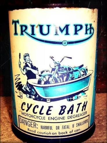
When the moto gets all ‘hacky-dorty’ the you need a can if this! Scrub off the old road grime and polish ‘er up. The bike always look refreshed with a bit if elbow grease and a stack of rags. Best done on a sunny day with a beer to whet your whistle.
Posted in Design, Graphics, Maintenance, Motorcycle Art, Triumph Motorcycle |
Leave a Comment »
July 15, 2014

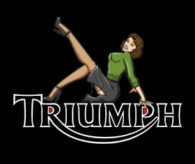
Glamor added to the new Triumph logo…
Posted in Gals, Graphics, Triumph Motorcycle |
2 Comments »
June 26, 2014
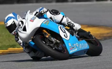
Let’s keep on this Gary Nixon vein…. A modern day Triumph Daytona in the blue and white color scheme and also numbered nine.

It can lean like a the best of ’em. Under the control of talent of course!

The 675 race bike is a genuine piece of speedy machinery. Needing a big space and fast corners to wring the best out of it!
Post title comes from Badfingers hit Baby Blue used to outstanding effect in the closing scene of the series Breaking Bad.
Posted in Graphics, Racing, Triumph Motorcycle |
Leave a Comment »
June 20, 2014

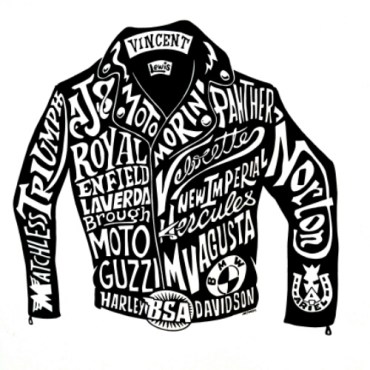
A screen print poster sold at Motoblot: the creases of a Lewis Leathers jacket hold the classic bike names from the golden age of motorcycling. Lewis are the riders protection of choice that improve with age and mileage: especially in the temperate damp airs of Britain.

Posted in Clothing, Design, Graphics, Motorcycle Art |
2 Comments »
June 16, 2014

Of course Triumph was represented in the majority at the show. I looked at a few examples of how the brand was marked. The traditional name badge as well as the logo is a common touch; sometimes a Union Flag harks the country of origin of these Machines. I particularly like the embroidered name on the seat. The cross stitched padding in nifty too!

Posted in Chicago, Design, Graphics, Triumph Motorcycle |
Leave a Comment »
June 8, 2014

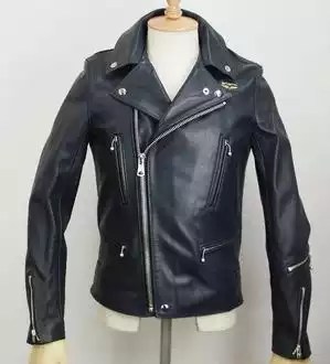
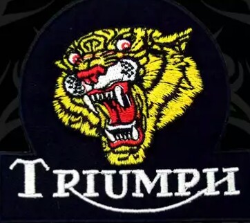
A feline patch suitable for any leather jacket. Hellcat!
Posted in Clothing, Graphics, Triumph Motorcycle |
Leave a Comment »
June 4, 2014
Branding is a name, branding is identity, branding is recognition. In the motorcycle world none more so than Triumph. With over a century of visibility the marques logo has developed and adapted with its place through history to create a timeless brand.

The latest logo was developed by the ad agency Wolff Olins.

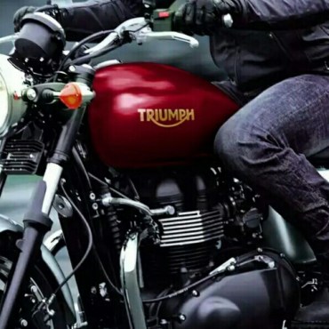
It has evened out lettering, equal height and rounded off serif to create a hint of slope and movement. Looks good on the tank…
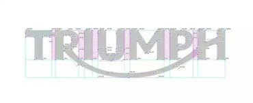
For the nerdy graphic designers…

Here’s the technical font structure and letter space kerning. More to it than meets the eye for sure.

Posted in Graphics, History, Motorcycle Art, Triumph Motorcycle |
Leave a Comment »
May 30, 2014

Exquisite technical illustration from the masters hand. This is Lawrie Watts at his finest: taking a complex machine, engine or entire vehicle and in perfectly weighted line work achieves both x-ray vision and form of assemblage.

It reminds me of the old hand drawn plans and details I had to prepare before computers were in the office. Ink, mylar and stinking dyline machines…
Posted in Graphics, Motorcycle Art, Triumph Motorcycle |
3 Comments »
May 27, 2014

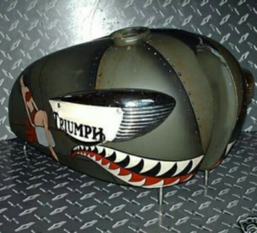
Another example of the aggressive shark tooth’d grimace seen on the warbirds of WW2. This would look smart on the Tiger Cub tank. Not too much more room for the bomb ridin’ gal though. Olive Drab and red backed pointy teeth gives a nasty bite! Gnash!

Posted in Aircraft, Graphics, Military, Motorcycle Art, Triumph Cub |
3 Comments »
May 26, 2014

Blue sky graphic with streaming air speeding past this ink print of the suitably dressed period biker and his Triumph. Classic comic penwork with speed lines imply the moving moto.
Posted in Graphics, Motorcycle Art, Triumph Motorcycle |
Leave a Comment »
May 10, 2014

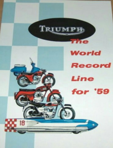
Fifty Five years ago: from the Tigress moped, Tiger Cub, Thunderbird, the Bonneville; all sold on the promise, and proven speed, of superiority on the road. The Record was Johnny Allen’s Devils Arrow which, under the methanol fuelling reached a two-pass speed of 193.3 mph with a 650 Triumph engine.
Posted in Graphics, Motorcycle Poster, Triumph Motorcycle |
Leave a Comment »
May 8, 2014

When you want go, get a Triumph. Or so says the promotional literature. Another splendid period pen and ink illustration.
After Kipling:
If you can fill the empty hour with sixty minutes worth of distance ridden….
Posted in Graphics, Triumph Motorcycle |
Leave a Comment »
May 2, 2014

Don’t Draper couldn’t have said it any better: like some promotional imagery straight from the booze guzzling, cigarette smoking, sex addict ad agency cats of New Yorks Madison Avenue in the sixties. Clean graphics, straight to the point and makes sure the guy gets the gal with his Bonneville.
Posted in Gals, Graphics, Motorcycle Poster, Triumph Motorcycle |
Leave a Comment »
May 1, 2014

Growing up the flag of the United Kingdom was called the Union Jack. Now apparently it has been given its ‘correct’ term as the plain old Union Flag. The ‘jack’ flag being the bow flag hoisted on the jack staff of a naval ship. It’ll still be the Union Jack to me…. Well until the loss of St Andrews Saltire when Scots independence occurs.
Nevertheless it looks pretty good on the petrol tank of a Triumph Cub too!
Posted in Graphics, Triumph Cub |
1 Comment »


